Northbridge Analytics
Updated: Jun 23
Case study on AI logo redesign
Complexity type: CLEAN

In this logo redesign case study, we take a closer look at the most common problems found in AI-generated logo designs and show how a professional logo designer can refine them. The goal is to turn an imperfect AI logo concept into a clean, scalable vector logo that looks professional and works across every brand touchpoint.

Consistency is key in logo design. Repeating visual elements help guide the viewer’s eye and make shapes easier to understand. Humans naturally look for patterns, and logos are no exception. In this case, the angles of the two highlighted lines should be consistent, as this is what the eye intuitively expects.
Sometimes we can’t immediately explain what feels wrong with a shape — we just know something is off. Here, if we project the inner half-diamond shape from its center point, it does not properly align with the outer form, creating subtle visual tension.
Great logo design is always about simplification and clarity. Every element should have a clear purpose and a defined place. While the separation element here may look aesthetically pleasing at first glance, it unnecessarily breaks the arrow shape, making the overall design feel fragmented and confusing.
The logo incorporates a bridge and an arrow motif, referencing the company name and its connection to analytics. While the small diamond element might seem like a clever addition — echoing the bridge form — it does not contribute to the overall meaning or concept. As a result, it should be removed to maintain clarity and focus.
The bridge structure lacks consistency in its construction. Each segment uses a different number of sides, which disrupts visual harmony. Standardizing these shapes is essential to achieve a cohesive and professional look.
Final Result
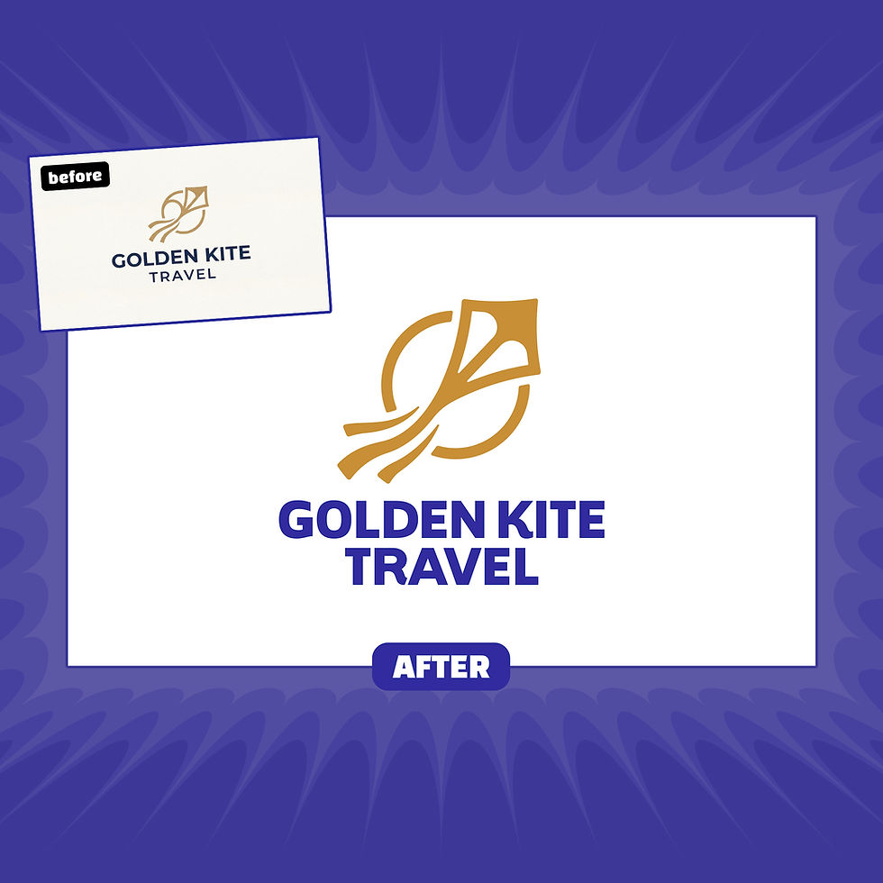
After correcting these issues, we unified the angles and refined the geometry of all elements. The final logo is clean, professional, visually balanced, and easy to understand — everything a strong brand identity should be.
Final logo
Download Sample Files
Download the sample file package to see exactly what you’ll receive with your upgraded, professionally redesigned vector logo — ready for web, print, and branding use.
Are you ready to Turn Your AI Logo Into a Real Brand?

Comments