Bright Nest Learning
Updated: Jun 23
Case study on AI logo redesign
Complexity type: ILLUSTRATED
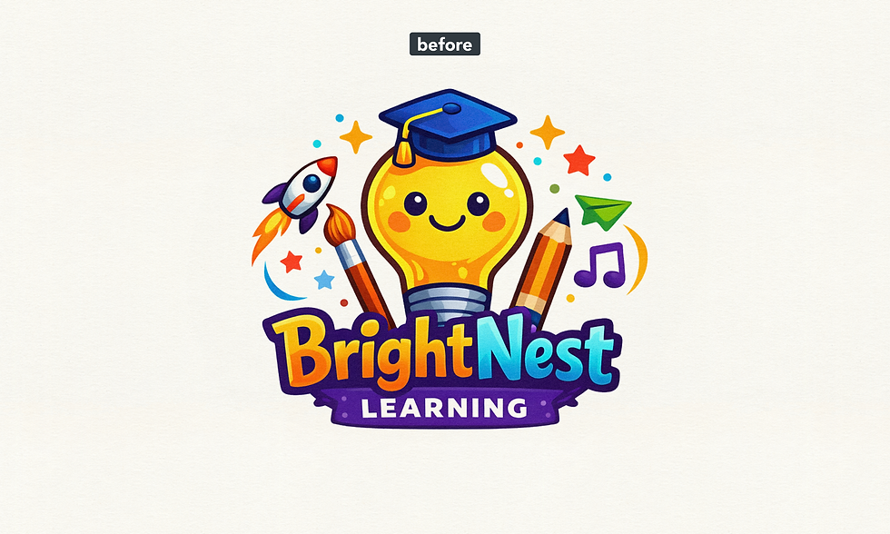
AI logo designs often look impressive at first glance, but many of them are not ready for real business use. In this logo redesign case study, we show how professional refinement can fix common AI logo mistakes and create a polished vector logo built for long-term branding.
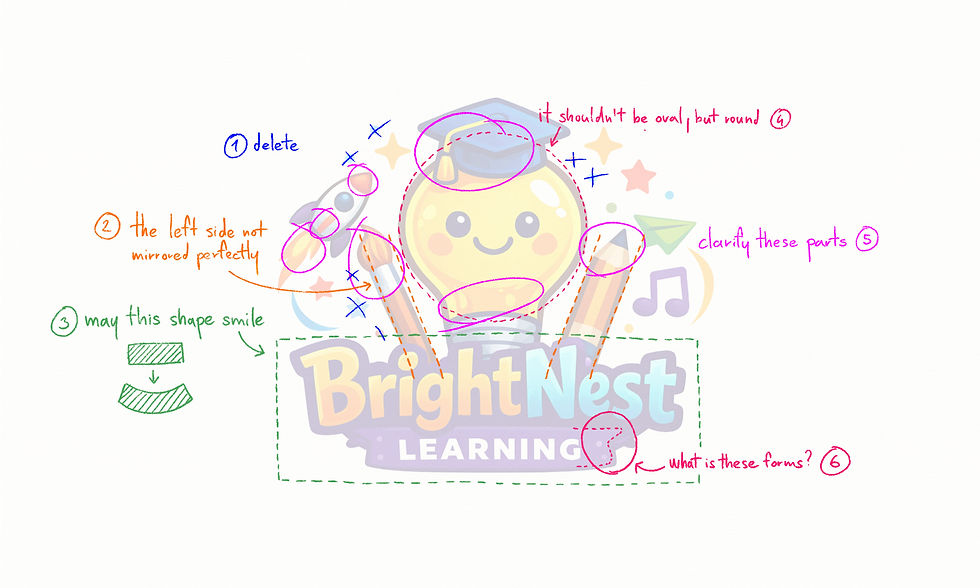
In this example, the design sits on the edge between illustration and logo. This requires extra care: the goal is to simplify the artwork enough to function as a logo, while still preserving its hand-drawn, character-driven charm.
Let’s break it down:
Unnecessary small details were removed to improve clarity and scalability. Logos need to work at all sizes, so simplification is essential.
The two drawing tools on each side should be rotated at the same angle. Without this consistency, the layout feels accidental and visually unstable.
For a playful, character-based logo, subtle curvature in the typography can enhance storytelling. In this case, a slight upward curve creates a smile-like effect, giving the logo a friendly and approachable personality.
The main character (the lightbulb) should follow a clean circular form. This aligns with common visual conventions and ensures recognizability. Compressing a naturally circular shape vertically should only be done with strong justification.
The AI introduced painterly shading and excessive detail in several areas, which is not suitable for a professional logo. These were cleaned up and converted into a clear, vector-friendly style.
Although this shape is not immediately distracting, it has no clear purpose. Simplifying or removing such elements improves overall cohesion.
Final Result
In the final version, we established a more structured composition while preserving the illustrated style as much as possible. The result is a clean, friendly, and easily recognizable logo that communicates a playful message without sacrificing professionalism.
Compared to the original, the number of colors was reduced, improving consistency, scalability, and brand clarity across all use cases.
Final redesigned logo
Download Sample Files
Download the sample file package to see exactly what you’ll receive with your upgraded, professionally redesigned vector logo — ready for web, print, and branding use.
Are you ready to Turn Your AI Logo Into a Real Brand?
Comments