Ironroot Tools
Updated: Jun 23
Case study on AI logo redesign
Complexity type: ILLUSTRATED
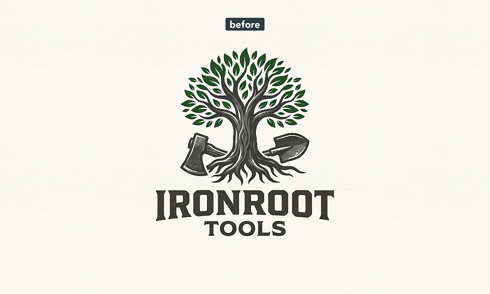
This redesign case study presents the transformation of an AI-generated logo into a cleaner, more reliable visual identity. By fixing common AI design flaws and rebuilding the logo as a professional vector asset, the final design becomes more scalable, consistent, and ready for real-world brand use.

In this section, the logos lean heavily toward illustration, with loose, hand-drawn shapes flowing into each other. The challenge here is to introduce structure and consistency without losing the organic, artistic feel of the original concept.
This particular AI-generated logo was especially complex — full of overlapping forms and uncontrolled details — making it a real challenge to identify underlying patterns and guide the design toward a clear, professional result.
The overall bounding shape of the logo is uneven and irregular. This was replaced with a clean circular framework to create a stable and balanced composition.
The colors are heavily textured, which is not suitable for a scalable logo. In addition, the contrast is too low, making it difficult to distinguish between different elements. These were simplified into clean, solid colors with stronger separation.
The gradients used in this section could work in some contexts, but here they feel inconsistent and distracting — especially since they only appear in one part of the logo. Removing them improved visual unity.
There is unnecessary overlap between elements, which reduces clarity and makes the design harder to interpret. This was cleaned up to improve readability.
The tools are positioned in a semi-horizontal pose, but their arrangement lacks clear intention. Repositioning them into a more confident and deliberate stance strengthens the composition.
The highlights on the tree are identical to those on the metallic tools, which creates a logical inconsistency. Different materials should be represented with distinct visual treatments.
The two tools should mirror each other in angle to create balance and visual harmony.
Final Result
In the final version, the logo was placed within a clean circular structure, providing a clear and professional foundation. The two tools were aligned in mirrored angles to reinforce balance and symmetry.
The color system was simplified into a high-contrast, easy-to-read palette, ensuring that each element is clearly distinguishable. The result is a cohesive, visually structured vector logo that retains its artistic character while becoming significantly more usable and brand-ready.
Redesigned logo
Download Sample Files
Download the sample file package to see exactly what you’ll receive with your upgraded, professionally redesigned vector logo — ready for web, print, and branding use.
Are you ready to Turn Your AI Logo Into a Real Brand?

Comments