Stonepath Engineering
Updated: Jun 23
Case study on AI logo redesign
Complexity type: DETAILED

In this AI logo redesign example, we break down the key problems found in the original AI-generated logo and explain how professional logo design can solve them. The focus is on improving structure, readability, scalability, and overall brand quality through a clean vector redesign.
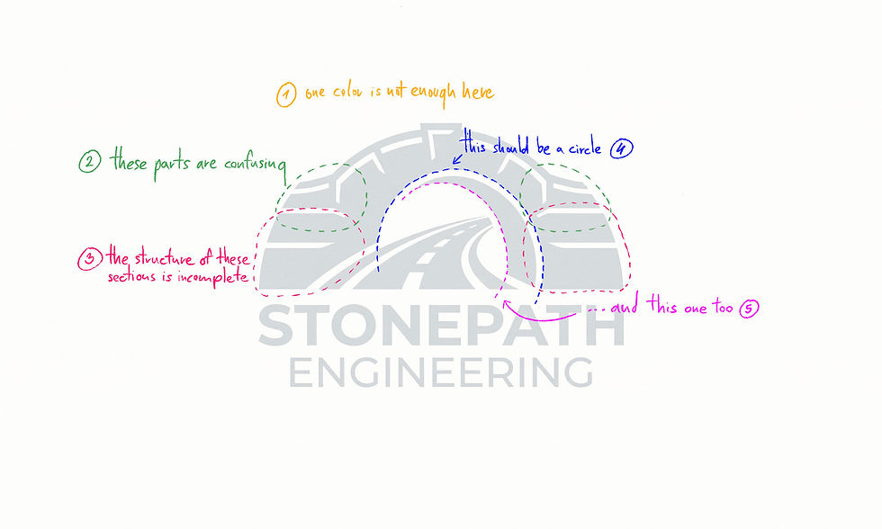
This logo is a classic example of a symmetry–asymmetry composition, where the contrast between structured and unstructured elements creates visual interest. However, to achieve a truly professional result, the design required refinement in consistency, readability, and geometric accuracy.
There is no strong reason for this logo to be monochromatic. Using a single color reduces readability and makes it harder to distinguish between elements. Introducing a controlled color system significantly improves clarity.
At its core, this is a well-constructed logo concept that only needed further refinement to improve consistency and clarity. The highlighted area is unnecessarily cluttered and overly complex, which reduces readability. This section was simplified to create a more focused and balanced composition.
The stone texture of the bridge is noticeably incomplete in this area. To enhance realism and visual coherence, additional detailing was introduced to better support the material language of the structure.
Since the outer silhouette of the bridge is fully symmetrical, the inner circular elements must also follow the same symmetry rules. There is no structural justification for an offset or distorted elliptical shape, as it breaks the visual logic of the design.
Same as in bullet point "4".
Final Result
In the final version, all elements were aligned to a single consistent circular framework, with proportions adjusted along a shared radial system.
The stone divisions were enhanced with subtle line-end detailing to improve visual contrast and depth, while previously inconsistent areas were cleaned and standardized. The result is a more cohesive, balanced, and professionally structured vector logo.
Final redesigned logo
Download Sample Files
Download the sample file package to see exactly what you’ll receive with your upgraded, professionally redesigned vector logo — ready for web, print, and branding use.
Are you ready to Turn Your AI Logo Into a Real Brand?


Comments