Aurora Forge Studios
Updated: Jun 23
Case study on AI logo redesign
Complexity type: DETAILED
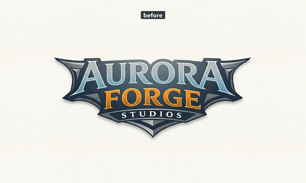
In this case study, we demonstrate how professional designers can improve an AI-made logo by correcting weak composition, inconsistent geometry, and usability issues. The final goal is a clean, scalable, brand-ready logo that performs well across all visual applications.
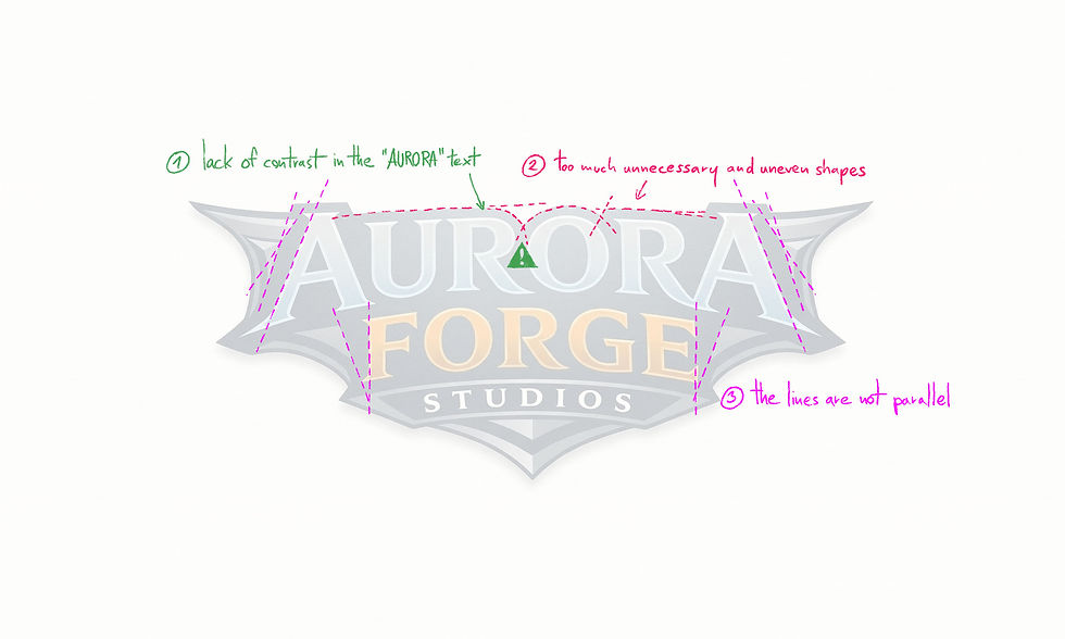
Though the AURORA lettering is the most important element of the logo, it blends into the background and lacks visual emphasis. Strengthening contrast and hierarchy was essential to make the brand name stand out.
The upper section resembles a magazine-style headline graphic, which can work in editorial design, but feels unbalanced and inconsistent in a logo context. It needed to be simplified and aligned with the overall structure.
The form language of the logo is quite freeform, which allows for creative, non-figurative elements. However, wherever possible, introducing structure improves clarity and professionalism. In this case, the lines should follow a parallel system to create visual order.
Final Result
In the refined version, the curves were unified, and both the angles and spacing were standardized to create a consistent geometric system. The overall base shape of the logo was also restructured into a symmetrical layout, which is reinforced by the top section.
A central notch was introduced to break the monotony of the lines while naturally guiding the viewer’s eye toward the main text.
The AURORA and FORGE lettering were given a unified color treatment, allowing them to stand out clearly from the more muted background. The result is a clean, professional vector logo with strong readability and visual hierarchy.
Final redesigned logo
Download Sample Files
Download the sample file package to see exactly what you’ll receive with your upgraded, professionally redesigned vector logo — ready for web, print, and branding use.
Are you ready to Turn Your AI Logo Into a Real Brand?
Comments