Silver Maple Logistics
Updated: Jun 23
Case study on AI logo redesign
Complexity type: DETAILED

This logo redesign case study shows how an AI-generated logo concept can be upgraded into a more professional and functional brand identity. We identify the main design flaws, refine the visual system, and rebuild the logo into a clean vector format suitable for web, print, and everyday branding.
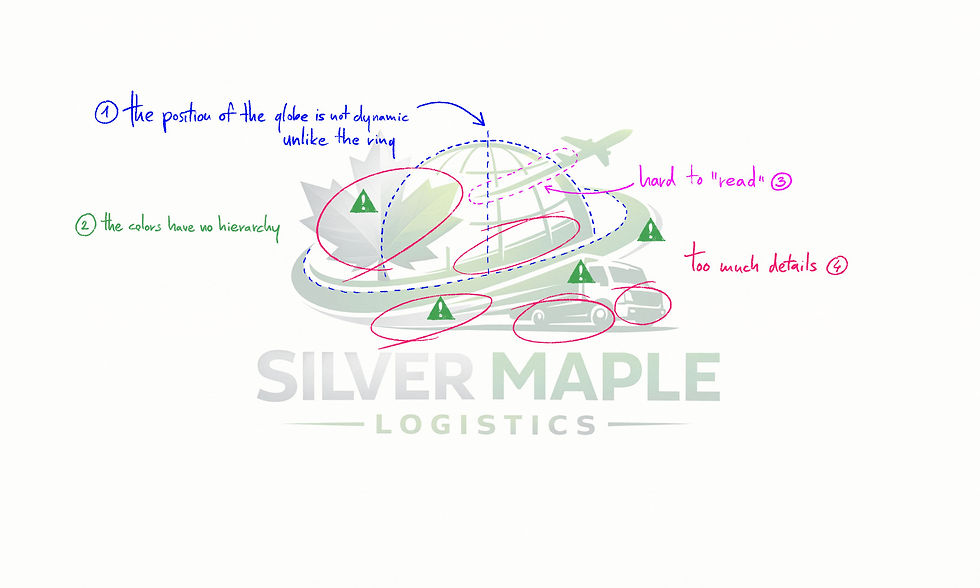
This AI-generated logo combines multiple strong symbols — maple leaf, airplane, globe, and truck — resulting in a visually chaotic composition. The form language is inconsistent, the style fluctuates, and the color usage feels random. The main challenge was to unify these elements into a clear, professional logo system with consistent structure and color logic.
The globe sits awkwardly between a dynamic and a static visual style without committing to either. To improve clarity and energy, the design direction was pushed toward a more dynamic form language.
The color usage is inconsistent and lacks a clear system. The alternating green and silver elements appear arbitrary, which weakens the brand identity. These were reorganized into a clear visual hierarchy to improve readability and cohesion.
The airplane trail is both hard to interpret and inaccurate. Contrails originate from the engines, not arbitrarily from the body of the plane. This detail was corrected to improve both realism and clarity.
The logo contains an excess of unnecessary details, creating visual overload. In logo design, simplicity is essential for recognition and usability, so reducing these elements was a key step in the refinement process.
Final Result
In the final version, the globe and its ring were tilted by 15 degrees to introduce a controlled sense of motion. All shapes were simplified to create a cleaner and more consistent visual language.
The relationship between the circular arc and the truck was refined to feel natural and easy to read, while the color system now clearly separates different elements without creating confusion.
Multiple variations were tested for the maple leaf to preserve the original dual-color concept, but every attempt resulted in visual clutter. Ultimately, a single-color solution was chosen to maintain clarity and achieve a more professional, balanced logo.
Final redesigned logo
Download Sample Files
Download the sample file package to see exactly what you’ll receive with your upgraded, professionally redesigned vector logo — ready for web, print, and branding use.
Are you ready to Turn Your AI Logo Into a Real Brand?

Comments