Skyline Habitat Design
Updated: Jun 23
Case study on AI logo redesign
Complexity type: DETAILED

AI-generated logos can be a useful starting point, but they often need professional refinement before they are ready for business use. In this logo case study, we show how a designer can fix the most common AI logo design problems and turn the concept into a polished, scalable vector logo.

At first glance, this AI-generated logo may look acceptable, but closer inspection reveals a combination of competing visual styles and random elements that make it difficult to read. It also fails to follow basic compositional principles, which results in a confusing and inconsistent design.
The background buildings do not contribute meaningfully to the concept. Their number, shape, and proportions feel arbitrary, and they function as oversized supporting elements. In addition, the mix of colors and forms lacks any internal consistency or visual system, which weakens the overall structure of the logo.
There are two correct approaches to constructing spatial forms in logo design:
Perspective-based construction, where lines converge toward a vanishing point
Isometric construction, where lines remain parallel
Both methods are valid, but they must be applied consistently. In this design, however, the lines are inconsistent and do not follow either system, resulting in a visually unstable structure.
Same as in bullet point "2".
Although the overlapping lines create a sense of depth, they also generate irregular and uneven negative spaces. These inconsistencies reduce readability and weaken the clarity of the composition.
Visual elements in a logo must either follow a consistent system or be removed entirely. Partial or inconsistent usage leads to confusion and reduces brand recognition.
Final Result
In the refined version, the skyscrapers were reorganized into a clean triangular composition and pushed into the background as supporting elements. Their linework and color treatment were unified to create a consistent visual language.
The foreground house was also standardized in terms of structure and line quality. While its core geometry was preserved, it was enhanced with a small attic window to strengthen the feeling of warmth and create a more inviting, “home-like” impression.
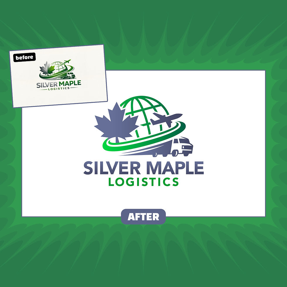
Final redesigned logo
Download Sample Files
Download the sample file package to see exactly what you’ll receive with your upgraded, professionally redesigned vector logo — ready for web, print, and branding use.
Are you ready to Turn Your AI Logo Into a Real Brand?

Comments